
A potential customer in Omaha searches for a contractor, attorney, retailer, or local service provider from a phone while waiting in a parking lot. They land on a site where the text is too small, the menu is hard to use, and the contact form disappears off the screen. Most will not wait for a fix. They will return to search results and choose a competitor. Responsive website design for small business protects against that lost opportunity by making your website useful, credible, and conversion-focused on the screens customers actually use.
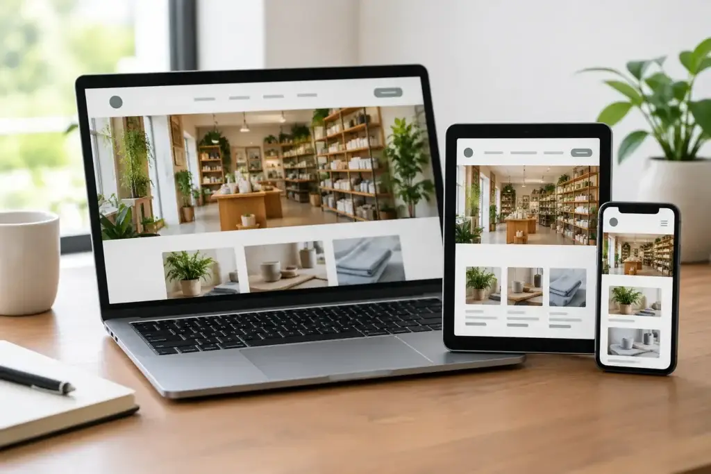
A responsive site adjusts its layout, images, navigation, and calls to action for phones, tablets, laptops, and desktop monitors. It is not simply a desktop site squeezed into a smaller display. Done well, it gives every visitor a clear path from first impression to the next step, whether that means calling your office, requesting a quote, booking an appointment, or making a purchase.
Why Mobile Experience Affects Business Growth
For many small businesses, a website is the first real interaction a customer has with the brand. Before they call, visit your location, or submit an inquiry, they are deciding whether your business looks current, trustworthy, and easy to work with. An outdated or difficult mobile experience can create doubt even when your service is excellent.
Mobile visitors tend to have a specific goal. They may need your hours, directions, pricing context, proof of your experience, or a fast way to contact someone. If basic information is buried under oversized graphics or a complicated navigation menu, the visitor has to work too hard. Responsive design reduces that friction and keeps attention focused on the action that matters.
It also supports visibility. Search engines aim to send users to pages that provide a good experience, especially on mobile devices. Responsive design is not an SEO strategy by itself, and it will not replace quality content or local optimization. However, it gives your search strategy a stronger foundation by helping pages load properly, remain readable, and work consistently across devices.
Responsive Website Design for Small Business Is About More Than Resizing
A mobile-friendly layout is the baseline. A conversion-oriented responsive website asks a more valuable question: what does this visitor need to do next, and how can the page make that decision easy?
For a local plumbing company, the priority may be a visible click-to-call button, service-area information, and emergency availability. For a professional firm, it may be a concise explanation of services, credentials, and a consultation request form. An e-commerce business may need product images that load quickly, straightforward filtering, and a checkout process that does not create extra steps.
The right approach depends on your audience, sales cycle, and service model. A restaurant can benefit from a prominent menu and directions. A B2B company with a longer buying process may need case studies, educational content, and several ways to begin a conversation. Responsive design should support those priorities rather than force every business into the same template.
Navigation Should Feel Obvious
Small screens leave little room for clutter. A clean mobile navigation structure helps visitors find core pages without scrolling through a long list of minor options. Keep primary choices centered on the information that drives inquiries and sales: services, products, about, contact, and location details where relevant.
This does not mean stripping away useful content. It means organizing it intelligently. Secondary material such as policies, career information, or detailed resources can still be available without competing with the first actions a prospective customer is most likely to take.
Calls to Action Need to Earn Their Space
Every important page should make the next step clear. Generic buttons such as “Learn More” have a place, but high-intent visitors often respond better when the action matches their goal: “Request a Free Quote,” “Schedule a Consultation,” “Call Our Team,” or “Shop the Collection.”
On mobile, placement matters. A call to action should be easy to reach after a visitor understands the offer, not hidden after several screens of text. Repeating a relevant action lower on a longer page can be helpful, especially for service businesses. The key is clarity, not pressure.
The Design Choices That Build Trust Fast
Visitors make quick judgments, but trust is built through a series of details. Responsive design gives those details room to work together across every device.
Readable typography is one of the most overlooked factors. If users have to pinch and zoom to read your services, reviews, or policies, they may not stay long enough to understand your value. Strong contrast, logical spacing, and short sections make essential information easier to scan.
Images should reinforce the business, not slow down the page. Original photography of your team, completed work, products, or location can make a meaningful difference in credibility. Large image files, autoplay videos, and decorative effects can create a trade-off by hurting page speed. Use visual elements with a purpose, and optimize them so the site remains responsive in both layout and performance.
Trust signals also need to be visible where decisions happen. Customer testimonials, certifications, years in business, service areas, guarantees, and clear contact details can reduce hesitation. A visitor should not have to hunt for proof that your business is established and accountable.
Common Problems That Cost Small Businesses Leads
Many website issues are easy to miss when the site is reviewed only on a large office monitor. Test it on actual phones and tablets, not just a browser preview. You may find that buttons sit too close together, forms require unnecessary fields, images crop awkwardly, or pop-ups block the page.
Slow load times are another common problem. A beautiful homepage does not help if a visitor leaves before the content appears. Heavy video backgrounds, uncompressed photos, excessive plugins, and poorly managed scripts can all weigh down a site. Some features may be worth the performance cost, but the decision should be intentional and measured against their impact on leads and sales.
A second problem is treating the homepage as the whole website. Search visitors often land directly on a service page, blog post, product page, or location page. Each of those pages needs to look polished and provide a clear next step on mobile. If your paid ads or SEO efforts drive qualified traffic to weak landing pages, your marketing budget has less chance to produce results.
Finally, avoid designing around internal assumptions. Business owners know their offerings so well that they can overlook questions a new customer has. Clear service descriptions, plain-language benefits, pricing guidance when appropriate, and an easy way to ask questions help bridge that gap.
A Practical Process for Improving Your Website
Start with a website review focused on real customer behavior. Identify the pages receiving the most traffic, the devices visitors use, and the actions that matter most to your business. A site with strong mobile traffic but few inquiries may need clearer calls to action, faster pages, or a simpler form. A site with low traffic may need an integrated plan that includes SEO, Google Ads, social media, and content alongside design improvements.
Next, map the visitor journey. Consider what someone needs to know before they contact you and what may stop them from moving forward. The answer often reveals useful page improvements: a service-area map, a stronger portfolio, more direct messaging, transparent process details, or a better appointment flow.
Then, measure after launch. Track form submissions, phone calls, appointment requests, sales, and the performance of key landing pages. Design is not a one-time decoration project. Your business changes, customer expectations shift, and performance data can show where the site needs attention.
At TLK Creative Enterprises, responsive web design is approached as a digital storefront built to support visibility and measurable growth. The goal is to pair a polished brand presentation with strategic structure, so the traffic generated through search, advertising, and social media has a stronger chance to convert.
Your website does not need every trend or flashy feature to compete. It needs to respect your customers’ time, answer their questions, and make reaching your business feel like the obvious next step. Start by viewing your most important pages from a customer’s phone. The gaps you find can become the next opportunities for growth.